September 27, 2023 • Posted by Design Bay Area
To celebrate Kit Hinrichs new book and legendary career, we asked JD Beltran to sit down with Kit to discuss where he’s been and how he got here and insights into his book. Our thanks go out to JD and Kit for collaborating! The following is the result of an evening in conversation.
You’re on your phone scrolling through your feed of hundreds—no thousands—of images but then, for some reason, you stop. You actually spend time with one, in particular (that doesn’t involve a cat). Or, perhaps, you’re in your Lyft or on the bus at a stoplight. A billboard image across the street is so striking that when the light turns green, you crane your neck out the window to stare at it just a little longer.
What’s the secret? How does what you can’t unsee become part of the fabric of our visual landscape? That strange expression on the model’s face? Those large pink letters whose text provoked an uncomfortable thought? Just the right tone of Pantone Red in that swoosh? (That Instagram algorithm?)
Think again. It’s the secret narrative behind that iconography—whispering a story to you.
Whisperer:
dictionary.com
a person who has a special ability to calm, control, or influence another person based on an understanding of that person’s motives, needs, etc.
Enter Kit Hinrichs, the ultimate design whisperer who is, indeed, one of our culture’s original “influencers.” For over the last fifty years, he’s managed to abracadabra the right potion of type, icon, composition, color and image to create “short stories” in design that have become such a fabric of our culture, we don’t even realize they’re still talking to us.
So it’s no surprise that Hinrichs was inducted into the Alliance Graphique Internationale (the equivalent of the Oscars of graphic design) and in 2004 became an AIGA medalist, the field’s highest honor. And now, a special gift—fifty years in the making—is the stunningly gorgeous print retrospective of his work by Graphis, the world’s most prestigious and renowned publisher in Design, Advertising, Art/Illustration, and Photography.

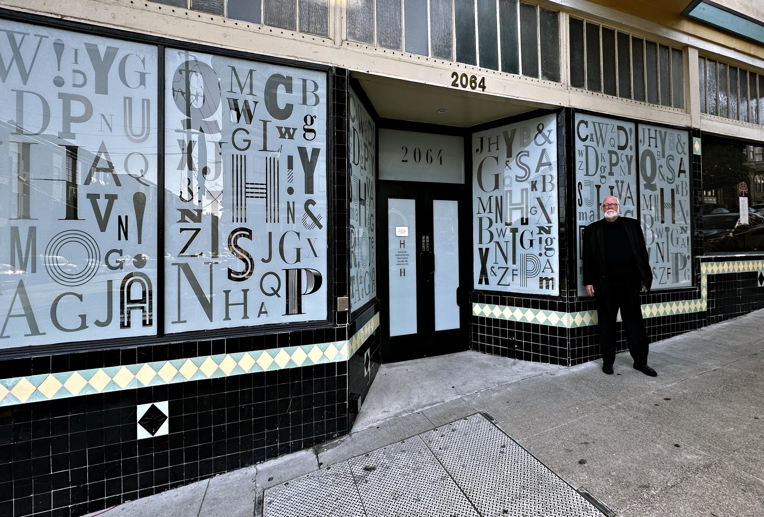
Photo credit: Studio Hinrichs
Narrative Design presents hundreds of examples of Hinrich’s most iconic work in rich, dimensional color, also offering the backstory of how he arrived at the solutions. In the book, Hinrichs also relates the early influences that drew him to his profession, shaping his appreciation for adapting storytelling techniques to make his design more impactful.
His secret and longevity has been in recognizing, early on, the power of what he deems “narrative design.” He notes, “An early mantra from my instructors was, ‘Design is not only about style, it’s about ideas.. . Style and technique are the tools to express good ideas, not a substitute for them.’” Renowned New York Times art director and journalist Steve Heller lauded Hinrichs’ luminous “skill and talent to make words and pictures on paper come alive,” and observed, “For Hinrichs, magic is in the details—and he seems to love including small narrative-enhancing details in almost everything he makes.”
Hinrichs’ overriding philosophy? “I have found that the role of design is to make the complex, simple; the opaque, transparent; the unstructured, concrete; the obtuse, accessible; the obvious, exciting, and the ordinary, beautiful.”
Our current culture and technology platforms teeming with visual stimuli and omnipresent imagery (96% of GenXers won’t go to the bathroom without their iPhone) make the challenge of designers even more daunting. It’s no longer text, color, space, and object or figure. Hinrichs laughs, “In trying to impress upon young designers how radically design has changed since I was a student at ArtCenter, I often use the analogy: ‘First, there was cave painting, and then, I entered the field.’”
So how does one coax visual elements into something indelible? Or, as Hinrichs describes it, “How do you create a new visual ‘language’ to encapsulate an idea, an identity?”
Beginnings on the Warner Brothers Film Lot
It’s fitting that Hinrichs’ origins in design began on the Warner Bros. Studio Burbank lot. As a child, he’d accompany his sound technician father to work, and became vividly immersed in live storytelling being created before his eyes: “Actors to script girls, directors to key grips, wardrobe assistants to make-up artists and a matrix of people were all working together to create a single cohesive and engaging narrative. It was a window into my future as a narrative designer.”
His narrative methodology was further shaped by an undergraduate design education at ArtCenter College of Design in the early 1960s. “Hues, values, texture, the Golden Section, typography as imagery, variations on a theme, biomimicry, Serif, Sans Serif, “fast and slow” curves, chiaroscuro, ‘first reading,’ and 3-point perspective, just to name a few lessons that were new to me.”
Combined with his early filmic influences, Hinrich’s design approaches seem to parallel directing tiny films or short stories, the actors a set of letters and images floating within a set. The type: thick or thin? serif or sans serif? Hierarchy? Texture? And now, the other players. Color. Scale. Composition. Objects. People. Dimensionality. How does a designer elaborate on that story being created with the visual elements’ relationship to the other actors and characters they’re collaborating with? And, of course, that most important “negative space.” Think of it as an actor pausing for a split second before their next line—or perhaps a full minute.
For example, the thick and thin strokes and stems of the marbled, serifed, upper case letter “A” in Hinrich’s magnificent Antiquarian Book Print & Paper Fair poster from 2012 could only be perceived, sharpened, and realized, were the letter not backdropped by the expanse of cream-colored negative space.
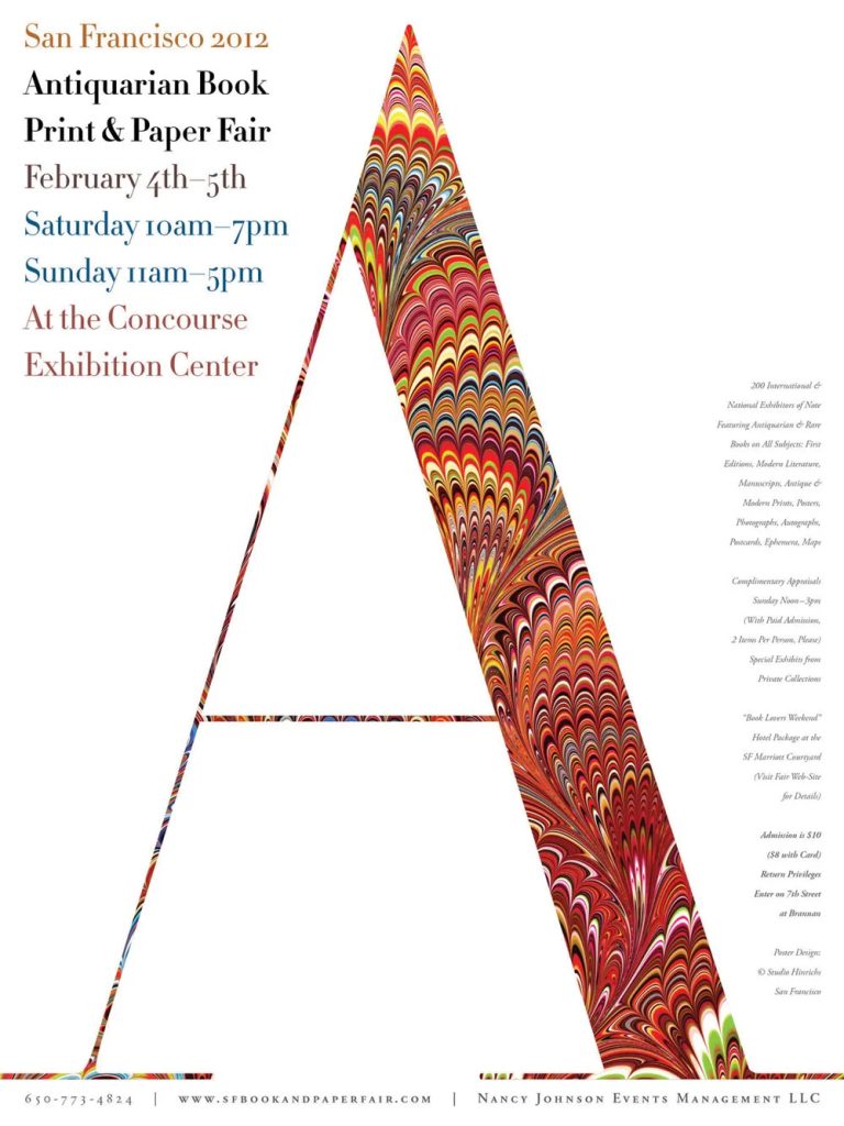
Photo credit: Studio Hinrichs
Design royalty Massimo Vignelli once remarked, “It’s the space you put between the notes that makes the music.”
An Early Life of Community Service and Social Impact
Midway through his ArtCenter education, Hinrichs traveled to West Germany to work at a boy’s youth home in in the midst of the Cold War. “It became a pivotal moment in my life and career: being exposed to, and living in a culture with new customs, foods, language, music, media and politics. . . What better view into an evolving world culture.” He was thrust into a new language, and new architecture, technology, music, magazines, and culture. “I had to experience things I was not comfortable with. But then I was able to bring that experience back. I learned how to look at things from multiple points of view. . . I think the most important thing you can do in your life is to travel.”
Armed with this seminal journey, Hinrichs realized his strong mission as a designer. “How can we help build a better culture? It’s a delicate balance: the commercial success of one’s work with the visual responsibility we have to our culture. We are often asked to wear several hats in our profession—salesman, confidant and teacher—to clearly communicate a service, product, event or concept usually not of our choosing. A worthwhile challenge. The designer’s conundrum is to effectively use our skills for our clients’ needs without neglecting our equally important ethical responsibility to create a landscape that always improves and never denigrates our world visual culture.”
Creating Time Magazine Covers Five Years Out of ArtCenter
A genuine design wunderkind, Time Magazine commissioned Hinrichs to create five assemblage covers for the magazine only five years after he finished his ArtCenter undergraduate education. Subsequently, he created his own firm and worked his way further up in the field, and then, in 1986, Pentagram Partners in London and New York (known as one of the most esteemed graphic design firms worldwide) requested he merge with it to head the West Coast office in San Francisco (Hinrichs’ wife Linda, who he’d met at ArtCenter while both were students, also joined Pentagram as the firm’s first female partner). He remained with Pentagram for 23 years until 2009, then opened his independent design firm Studio Hinrichs in San Francisco.
Hinrichs’ design experience incorporates a wide range of projects, including identity design, corporate communications, promotion, packaging, editorial and exhibition design, and his work is included in the permanent collections of the Museum of Modern Art, New York, the San Francisco Museum of Modern Art and the Library of Congress. He also is co-author of four books, including Typewise, Long May She Wave, 100 American Flag Icons and The Pentagram Papers.

Credit: Logos courtesy of Studio Henrichs
The Elements of “Narrative Design”
It’s no surprise that Hinrichs confesses one of his predominant passions is telling stories. “As a consequence, I have become an obsessive narrative designer. I find stories everywhere waiting to be told, and, fortunately, I have been able to do that through design. By story, I mean more than editorial content. I mean communicating a sense of the subject, albeit a client’s business and philosophy or an event, graphically through print, packaging, videos or environmental signage.”
Inspirations emanate from daily life. “I look at what other people are doing whether it’s a painting from the 17th Century or something that was done on the internet yesterday. I’m always looking. That’s probably the one thing that is consistent. I’m not looking to copy. I’m really looking to be inspired. If there is something that I can do that might inspire me in the same way.”
And there’s no secret formula, either. “I’m not one to take a formulaic approach to design. I don’t believe in following a generic checklist and crossing each item off as the job proceeds, holding multiple boardroom meetings to discuss brand integrity, and testing every detail with focus groups. Not every job needs extensive audience research. Sometimes the overanalyzed solution will seem so tired, ordinary and expected that you lose sight of the goal, to excite and engage your audience. My sense is that sometimes you need to take a little leap of faith and do things the way your gut tells you they need to be done.”
Type + Image + Space
Hinrichs believes in the power of type. “Type draws an emotional response. . . as many people know, I’m passionate about typography in all forms and about raising awareness of the unique beauty of individual letterforms and complete typefaces. I believe typography is under-appreciated because people often focus on only reading the text and are unaware of the beauty and power typography brings to the words.”
Akin to his colleagues and contemporaries Milton Glaser and Saul Bass (indeed, shortly after Hinrichs joined Pentagram, Bass told him he wished he would have joined Bass’ firm as a partner instead), Hinrichs also frequently taps into the storytelling potential of the figure, a universally understood shorthand. “A story can be encapsulated in a gesture, a posture, an action. The human form is like a short form of language. You can write something a page long but convey the same idea in a single, simple image.”
Faces are another element that shines in Hinrichs’ work. “Tapping into the face gives you an edge,” he’s observed. Indeed, the human face is the first “object” we recognize as infants, and we instinctively are drawn into recognizing a face if its elements are present. “Viewers are drawn to facial expressions that reveal the subject’s attitude, mood and personality,” Hinrichs observes, “even when the face is of a pet dog or sci-fi character.”
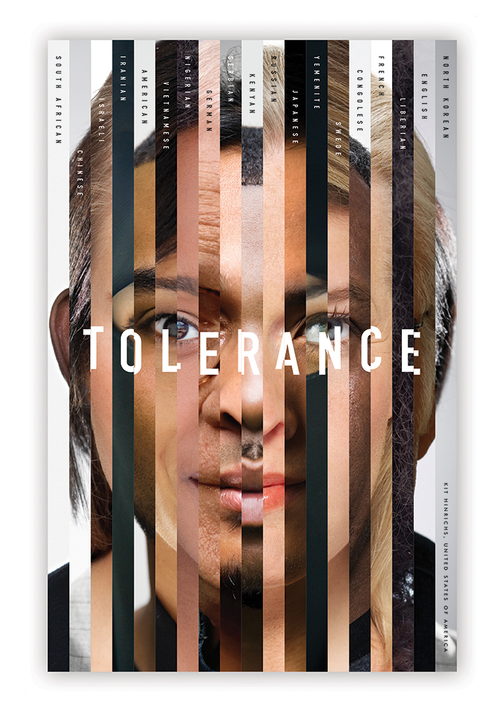
Photo credit: Studio Hinrichs
In discussions of his design practice, Hinrichs also constantly stresses how the success of his projects is indebted to the talent of his collaborators. “For me, design, at its best, is a visual story with the same excitement, pacing and emotional power of a great play or musical composition. And like producing a play, design is not a solitary act, but a collaboration that requires inspiring the talent and spirit of writers, illustrators, photographers, typographers and technicians. A successful outcome demands a strong, clear, consistent focus so that all elements ’speak’ in a single voice that engages the audience.”
Hinrichs’ California Academy of Sciences branding, deceptively simple, reflects this collaborative spirit. In developing their logo, called “the fabric of life,” his design solution tapped into the expertise of the Academy’s scientists and even the building’s architect. The tri-colored line forms not only mimic the structural threads that comprise human tissue (or the microscopic forms of a DNA helix), but cleverly echo the outlines of the hills of Renzo Piano’s green roof at the top of the science center’s building.
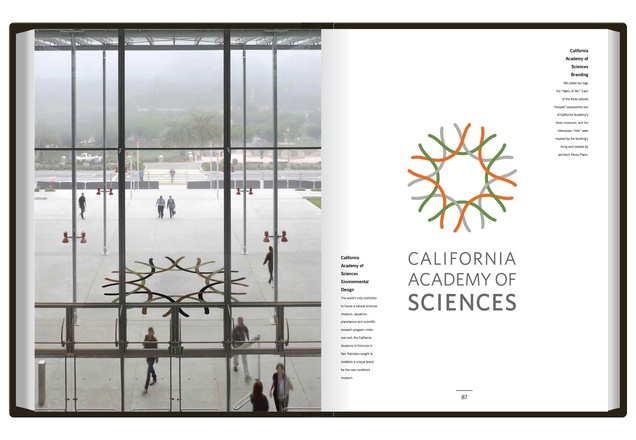
Photo credit: Studio Hinrichs
A Gift to the Design Field
Hinrichs not only elevated the field through his own rigorous and highly principled design practice, but in 1994 gifted fellow designers by founding @issue: Journal of Business & Design which grew out of a discussion and subsequent collaboration with writer and editor Delphine Hirasuna. The two recognized that “designers and business clients frequently talk past each other without appreciating their problem-solving process.” Sponsored by the Corporated Design Foundation and underwritten by Potlach paper company, @issue utilized case studies and interviews to demonstrate how smart design contributed to the financial success of a business. At its peak the journal enjoyed a circulation of 100,000 readers and after 15 years became an online publication, atissuejournal.com.
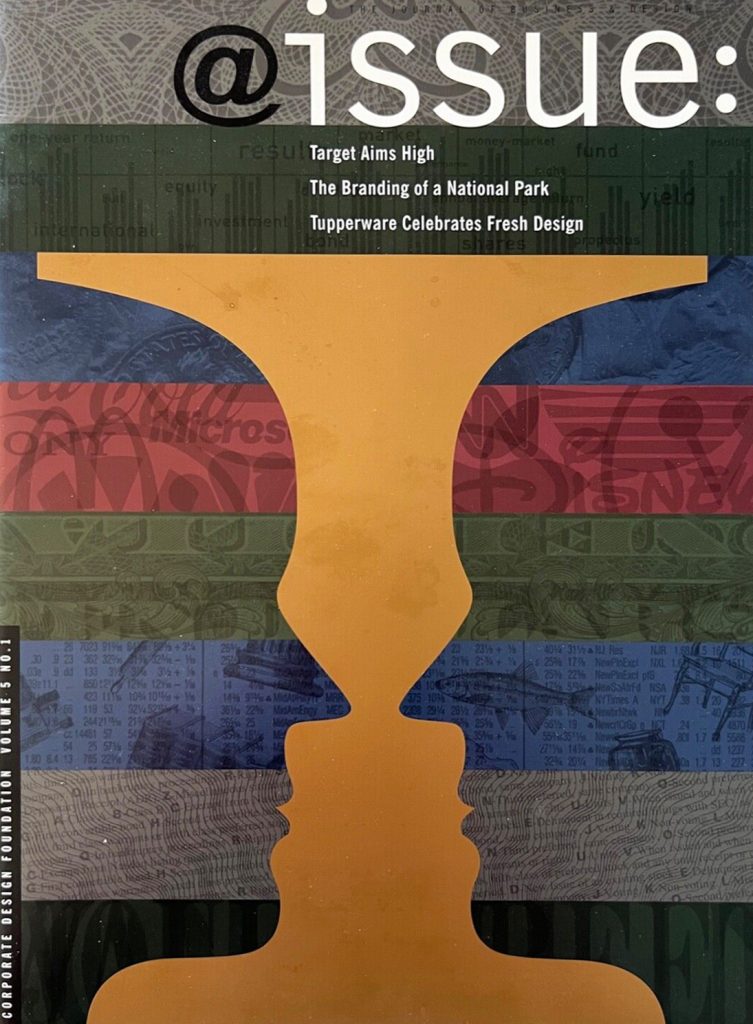
Photo credit: Studio Hinrichs
Observing the World, Being Relevant, And If You’re Not Swimming Forward, You’re Sinking
Were one to attempt to conjure a word that conveys Hinrichs, incandescent seems fitting.
Incandescent:
THE AMERICAN HERITAGE® DICTIONARY OF THE ENGLISH LANGUAGE, 5TH EDITION.
Characterized by ardent emotion, intensity, or brilliance.
Even after fifty years as a seminal figure in design and bequeathing a legacy of graphic design impact and excellence for future generations, Hinrichs’ youthfulness and energy still exude when he enters a room. It’s clear he chose a career that fosters his growth and learning, and that keeps him young.
“Enjoy what you do,” he advises. “To me, access to knowledge is often preceded by a troop of giggling clowns, dancing through the door of humor. People have to feel relaxed and comfortable before they allow you entry into their emotions. Wit is a wonderful door opener. One of my harshest criticisms came in a packaging class where my instructor said I couldn’t receive an “A” on a project because I had just “too much fun” in my work. The best compliment I ever received.”
And channel fearlessness, it seems. “I’m convinced that the riskiest thing a designer can do is to play it safe all the time. If you don’t take some risks, like our clients, ‘you’re not swimming forward, you’re sinking.’ No matter the project, stay focused on solving the problem for your client and doing the best work you can do at any particular time. It’s an old cliché, but you really are only as good as your last job. Stay relevant.”
Still Looking Forward to His Greatest Challenge
Hinrich’s overarching mantra? “What we do visually is tremendously important for the world. You can stop reading something, but you can’t stop seeing something. The impact of something visual is much stronger.” He echoes a thought from one of my former design professors—that designers are among the most powerful people in the world.
His studio practice continues its lifelong dedication to elevating social responsibility. Last year, he partnered with Graphis to organize an international Ukrainian protest poster campaign in response to the Russian invasion.
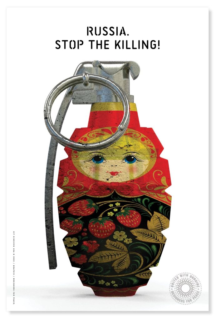
Photo credit: Studio Hinrichs
Hinrichs becomes contemplative when queried about his life’s most difficult challenges. “I like to think I haven’t had the greatest challenge yet! There are things that I would still like to do, haven’t done, and look forward to.”
“I think it’s one thing to understand what it is that we are doing and the effect we have on our culture today and in the future and where we’re going in the future. To be an effective designer, it helps to be an active observer of life. . . I just want the next generation of designers not to do what I’ve done—but to do what is right for them at that time and in our culture.
And words of wisdom to the future generations of designers? “Even the simplest projects, the easiest design solution that you have, represents the culture that we’re in and elevates our culture or diminishes it. I don’t think it’s just neutral. And so if you’re not doing something that makes things better, why do it. Why not do things that are the best they can be at that particular time. And that’s all I ask anybody to ask for themselves. I think that’s an important thing to do in life, not only in our field.”
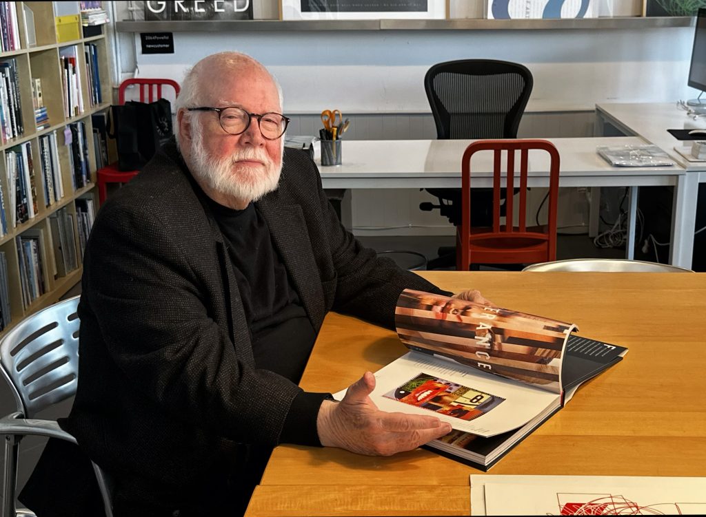
Photo credit: JD Beltran
Featured image photo credit: JD Beltran
Many thanks to JD Beltran for collaborating on this interview!
ABOUT JD BELTRAN:
JD Beltran is an award-winning journalist and writer, having written cultural columns for SFGate, the Huffington Post, Alta Online, Visual Art Source and FabrikMagazine. She is a longtime member of the San Francisco Writers’ Grotto and has co-written four books in the Grotto’s “642” and “712” series on cultivating the art of writing. Also a longtime educator in art and design, Beltran is Faculty in Design at San Francisco State University and formerly was Associate Faculty in Design and Interaction Design at California College of the Arts, and faculty in New Genres, Film, Art & Technology and Critical Studies at the San Francisco Art Institute. She has served as a commissioner on the San Francisco Arts Commission since 2009, supporting the city’s artists and stewarding the selection and care of the city’s public art collection.
Beltran also is an award-winning designer, media artist, and filmmaker. Her work has been exhibited internationally, including at the Walker Art Center, the San Francisco Museum of Modern Art, The Getty Institute, The Kitchen in New York, the MIT Media Lab, Cité des Ondes Vidéo et Art Électronique in Montreal, ProArte in St. Petersburg, Russia, and the Fei Contemporary Art Center in Shanghai, China. She is the recipient of some of design and art’s most honored awards, including for the creation of one of the top public artworks in the US (Public Art Network 2009), creating one of the top design works internationally (German Design Award 2019 and CES Innovation Award 2018) and for creating one of the top works blending art and technology worldwide (Top 20 Art & Technology Works Worldwide, New Technology Art Association 2014). She also received multiple annual awards from the former International Design Magazine (ID Magazine). Beltran’s latest creative project is a novel in progress that blends her writing with her life experience in the arts: “Pay Attention” illuminates the lives of six working artists from the San Francisco Art Institute as they attempt to launch their careers with skill, genius, or mere provocation.